In this post I attempt to analyze the conventions of a successful Quick Reference Guide.
What do the conventions of this genre - the Quick Reference Guide - seem to be?
- Quick, easy to read subtitles
- Bold fonts
- Attractive visuals
- Scannable paragraphs
- A lot of hyperlinking to other source
Many of the QRGs are formatted in a question and answer style of writing in order to draw the reader in to a specific part of the QRG. The subtitles are generally larger in font than the body but not as big as the title. The paragraphs are broken up in a way that are easily scannable with a lot of links to other sources. The QRGs are written in order to be scanned in order to give a quick summary of reliable facts.
What does the purpose of these QRGs seem to be?
The purpose of the QRG appears to be to convey as much information as possible in the most readable, easy format. As such there are a lot of bold typography in order to draw reader's eyes to. The subtitles are generally leaning towards one side or another which gives a clearer picture to the reader. The reader doesn't necessarily have to read the entire QRG in order to grasp the content.
Who is the intended audience for these different QRGs? Are they all intended for similar audiences? Or different? How & why?
The intended audience for these QRGs tends to be the general public. The subtitles are formatted and written in a way that easily understood by a multitude of people whether they have previously heard about the topic or not.
How do the QRGs use imagery or visuals? Why do you think they use them in this way?
The QRGs tend to use bold, bright visuals in order to draw attention from the reader. Had there been no visuals there might be not enough incentive for readers to stay on the page. The visuals draw the reader in and entice them to read more of what the QRG has to offer.
 |
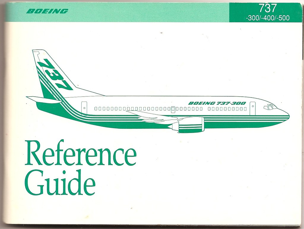
| Abbot, Bill. "Boeing 737-300/400/500 Reference Guide." 11/8/09 via Flickr. Creative Commons License. |
EDIT:
After reading Michael's, Mira's, and Namratha's blog posts I noticed a general trend among our posts. We generally all said the same thing in terms of the conventions of the quick reference guide like interesting title, subtitles, lots of visuals, and easy to read text. I liked how all of them emphasized the importance the design of the quick reference guide.
After reading Michael's, Mira's, and Namratha's blog posts I noticed a general trend among our posts. We generally all said the same thing in terms of the conventions of the quick reference guide like interesting title, subtitles, lots of visuals, and easy to read text. I liked how all of them emphasized the importance the design of the quick reference guide.
There is a lot of attention drawing done by writers in this genre. All the visuals and bold, questioning subtitles make the reader want to read more. I think that is why the audience can be the general public because anyone can read them or want to just based on the title or subtitles. For your conventions I think you could of combined bold fonts and subtitles and included the introduction paragraph because I believe that it is a very important convention. It introduces the topic and gives background information on it.
ReplyDeleteYou really emphasized the scan-ability aspect of this genre. I agree completely will this observation. I touched on this a lot in my personal QRG analyzation. This genre of writing is used to put a lot of information in a condensed format. It eliminates long loquacious writing, the making it more readable for the audience. You touched on Quick and easy to read, Bold fonts and Scannable paragraphs. These are all essential to the composition of a QRG.
ReplyDeleteI agree with you, that all of our posts and such about QRG are similar, especially because we went over it in class, and I took notes. I really liked the format of your post, especially the bullet points, because it kept it sweet and short. Great job!
ReplyDelete